


Choosing the right colour schemes for your interior isn't just about slapping some paint on the walls; it's about creating a mood, telling a story, and making a room feel just right. It's the art of combining colours to craft a space that feels completely, authentically you.
How Colour Schemes Transform Your Home Atmosphere
Think of your home's colour palette as its personality. A well-chosen scheme can make a cramped room feel like an airy retreat or turn a vast, empty space into a warm, inviting sanctuary. It guides your eye, highlights your home’s best features, and ties everything together with a sense of cohesion.
Here in Australia, our designs often pull inspiration straight from the landscape—from the deep blues of the coastline to the dusty greens and terracottas of the outback.
This design-led approach is a big part of Australia's booming interior design market, which was valued at USD 2.15 billion in 2024. A key trend fuelling this growth is the demand for functional homes with sophisticated backdrops, where neutral schemes with warm brown undertones like taupe and caramel are becoming incredibly popular. You can discover more insights about the Australian interior design market on expertmarketresearch.com.
What You Will Learn in This Guide
This guide breaks down everything you need to get your interior colour schemes sorted. We’ll walk you through how to:
- Understand Colour Theory without the confusing jargon, so you can start mixing and matching with real confidence.
- Explore Popular Schemes like monochromatic and complementary to find the mood that’s right for you.
- Apply Palettes Room-by-Room using practical, Aussie-inspired examples for your living room, bedroom, and more.
- Master the Role of Light and Texture and see how they can dramatically change your chosen colours.
To get you started, the table below gives a quick overview of the foundational colour schemes and the feelings they usually create. Have a look and see which approach resonates with your vision before we dive into the principles behind each one.
A Quick Guide to Interior Colour Schemes
Here’s a simple breakdown of the most common colour schemes to help you find your style. Each one is built on a different principle from the colour wheel, creating a distinct mood in any room.
| Scheme Type | Core Principle | Common Mood/Feeling |
|---|---|---|
| Monochromatic | Uses tones, tints, and shades of a single colour. | Calm, sophisticated, and serene. |
| Analogous | Uses colours that are next to each other on the colour wheel. | Harmonious, comfortable, and inviting. |
| Complementary | Uses colours opposite each other on the colour wheel. | Dynamic, vibrant, and high-energy. |
| Neutral + Accent | A base of neutral colours with a bold pop of a single colour. | Balanced, modern, and focused. |
Think of this table as your starting point. It’s a way to quickly identify a direction before we get into the nitty-gritty of building a palette from scratch.
Making Sense of Colour Theory Basics
Think of the colour wheel not as some complex tool for artists, but as your secret weapon for creating beautiful, cohesive colour schemes for your interior. It’s just a simple guide that shows you how colours relate to one another. Once you get your head around a few basic ideas, you'll feel so much more confident in the design choices you make.
Everything really does start with the basics you learned back in primary school. You have three primary colours: red, yellow, and blue. These are the parents of every other colour you can imagine; you simply can't create them by mixing other colours together.
The Building Blocks of Colour
When you start mixing these primary colours, you create the next layer of the family tree.
- Secondary Colours: This is what you get when you mix two primaries. Blue and yellow give you green, yellow and red make orange, and red and blue create purple. Simple.
- Tertiary Colours: Go one step further and mix a primary colour with its secondary neighbour, and you get those lovely, in-between shades like blue-green or red-orange.
Understanding this simple hierarchy is the first big step. It shows you how all colours are connected, which is the whole secret behind creating palettes that feel naturally balanced instead of just random. This logic is the foundation for every colour scheme you'll ever put together.
Understanding Hue, Saturation and Value
Beyond the basic wheel, there are three key ideas that will truly empower you to master colour in your home. Forget the jargon; these concepts are pretty straightforward and are absolutely essential for creating depth and interest in any room.
Hue is really just the pure, unadulterated colour itself—what you’d call red, blue, or green. It’s the identity of a colour before you’ve done anything to it.
Next up is saturation, which is all about the colour’s intensity or vividness. A highly saturated colour is bold and bright, like a fire-engine red. A less saturated, or desaturated, colour is more muted and greyed-out, like a soft, dusty rose. The easiest way to think of it is turning the "colour volume" up or down.
Finally, we have value, which just describes how light or dark a colour is. When you add white to a hue, you create a lighter "tint" (like getting pastel pink from red). Add black, and you get a darker "shade" (like a deep maroon). Playing with value is how you create contrast and stop a room from feeling flat, adding layers and visual interest to your chosen colour schemes interior.
Exploring Five Popular Interior Colour Schemes
Now that you've got the basics of colour theory down, we can start putting them to work. It's time to build the beautiful, intentional colour schemes interior designers use every day. Think of these schemes as tried-and-true recipes for creating a certain mood. They give you a simple framework, so you can combine colours with confidence instead of just guessing.
Each one offers a different way to tell your home’s story, from calm and quiet to bold and energetic. We'll explore five of the most reliable methods, giving you a clear path to finding the perfect palette for any room in your home.
Monochromatic: A Harmonious Haven
A monochromatic scheme is the very definition of sophistication and simplicity. It’s all about using different tones, tints, and shades of a single hue. Imagine a bedroom layered in various shades of serene sage green—from a deep forest green feature wall to pale mint cushions and a mid-tone olive throw.
This approach creates a cohesive and calming atmosphere because there are no jarring contrasts to fight for your attention. It’s an almost foolproof way to design a space that feels unified and restful. The real key to making it work is to bring in a wide range of textures—like linen, wool, and timber—to stop the room from feeling one-dimensional or flat.
This concept map breaks down the fundamental elements of colour theory that underpin every successful scheme.
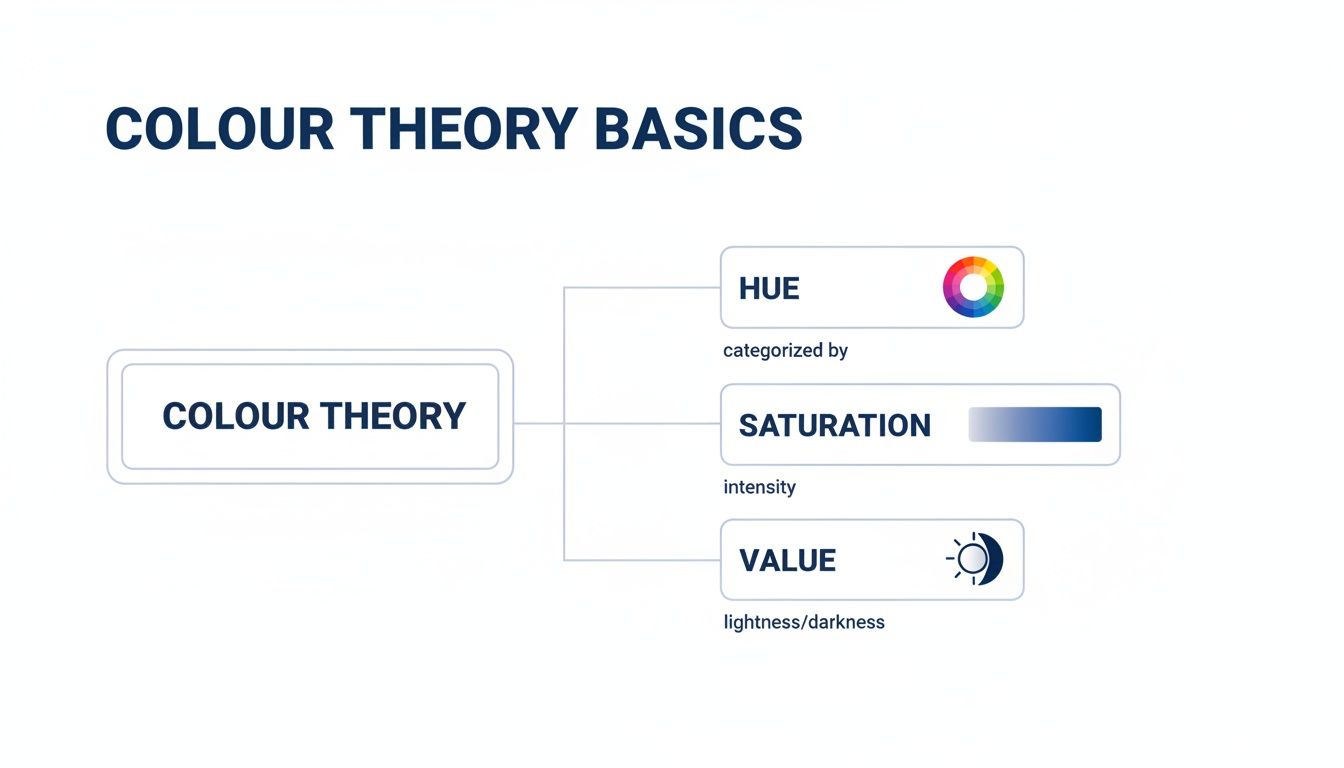
Getting a handle on hue, saturation, and value is crucial for creating depth, especially when you're working within a single-colour palette.
Analogous: Creating Natural Flow
For a look that’s harmonious but with a bit more complexity, an analogous scheme is a fantastic choice. This method uses colours that sit right next to each other on the colour wheel, like blue, blue-green, and green.
Because these colours share common tones, they blend together seamlessly, creating a rich yet soothing effect.
An analogous palette often mimics colour combinations found in nature, like the shifting tones of a sunset with its reds, oranges, and yellows. This is why it feels so inherently comfortable and easy on the eyes.
This scheme is perfect for creating a relaxed, inviting living room or dining area where you want conversation to flow as easily as the colours do.
Complementary: For Dynamic Energy
If you want to make a statement, a complementary colour scheme is your go-to. This involves pairing two colours from opposite sides of the colour wheel—think blue and orange, or red and green.
The high contrast between these hues creates a vibrant, dynamic, and energetic feeling. Now, bold doesn't have to mean overwhelming. You don't have to go all out with highly saturated colours. You could use softer versions, like a dusty blue paired with a muted terracotta, for a more subtle yet equally engaging effect.
This type of scheme works wonders in spaces where you want to spark creativity or conversation, like a home office or a kid's playroom.
Choosing Colour Palettes for Every Room
This is where the real fun begins. Once you’ve got a handle on the theory, you can start applying it room by room, tailoring your colour schemes interior to the unique feel and function of each space. A palette that works wonders in a cosy bedroom probably won’t hit the right notes in a bustling, open-plan living area.
The goal is to match the room’s job with the psychological vibe of its colours. Every room has a purpose, and the right palette helps it do it better.
Living Rooms The Welcoming Hub
Your living room is often the heart of the home—a multitasking space for relaxing, entertaining, and connecting. This means you need a palette that’s both welcoming and flexible enough to handle it all.
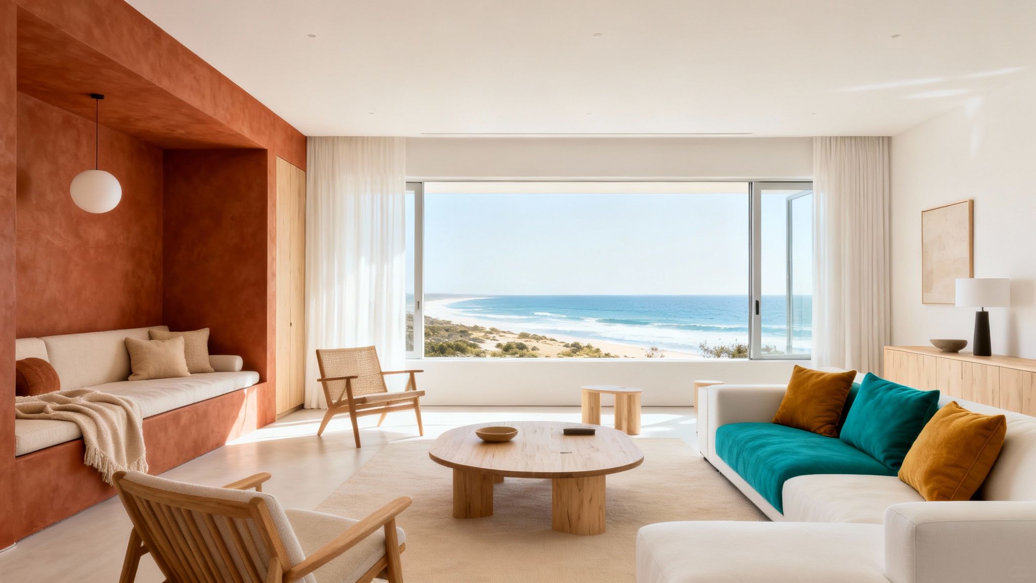
A neutral scheme is a popular and seriously effective choice. Using shades of warm grey, beige, or off-white creates a sophisticated backdrop that lets you inject personality through cushions, art, and throws. A classic Australian coastal look, for instance, might pair sandy whites and soft greys with pops of ocean blue and seafoam green.
If a grey sofa is your anchor piece, our guide on what colours go with a grey couch is packed with inspiration for building a balanced scheme around it.
Bedrooms Your Serene Sanctuary
The main job of a bedroom is rest and rejuvenation, so calming colour schemes are a natural fit. Colours that recede, like soft blues and gentle greens, are well-known for promoting tranquillity and can help create that perfect peaceful retreat.
Earthy, nature-inspired tones are particularly effective right now. In fact, forecasts show that earthy greens like sage and olive are surging in Australian interiors, bringing a sense of the outdoors in for a huge boost to your well-being. Deep, moody blue-greens and sky blues are also set to be popular, sitting beautifully within our local landscape.
When you’re designing a bedroom, think about how colours make you feel. A palette of muted terracotta, soft linen, and deep eucalyptus green can create a space that feels like a warm, grounding hug at the end of a long day.
Kitchens and Dining Areas The Energetic Core
Kitchens are often lively, energetic spaces, which makes them the perfect spot to experiment with more stimulating colours. You don’t have to paint every wall bright yellow, but a strategic accent can make a massive impact.
Picture a modern kitchen with sleek charcoal cabinetry. A splash of vibrant colour, like a zesty orange or a bold eucalyptus green on a splashback or island bench, can add a brilliant dose of energy and fun.
For dining areas, warmer colours like muted reds or rich terracottas are thought to stimulate conversation and appetite, making them excellent choices for spaces where people gather to eat and chat.
Once you've got these foundational ideas down, you can dive into a practical guide on how to choose paint colors for rooms to start applying these concepts to your own space.
How Light and Texture Influence Your Colours
A paint swatch is just the beginning of the story. Once you bring a colour home, two incredibly powerful forces take over and can completely transform how it looks and feels: light and texture. Getting your head around their influence is the real secret to creating colour schemes interior designers would swoon over.
Natural light is a living thing. It moves and changes all day long, and your wall colours change right along with it. The cool, crisp light of a south-facing Australian room will make colours appear sharper and brighter. Pop that same colour in a softer, warmer north-facing room, and you’ll start to see its yellow or red undertones come out to play.
That perfect cool grey paint you chose might look perfectly neutral in the morning but take on a subtle lavender hue as the warm afternoon sun streams in. This constant shift is what makes a room feel alive and dynamic.
The Critical Role of Texture
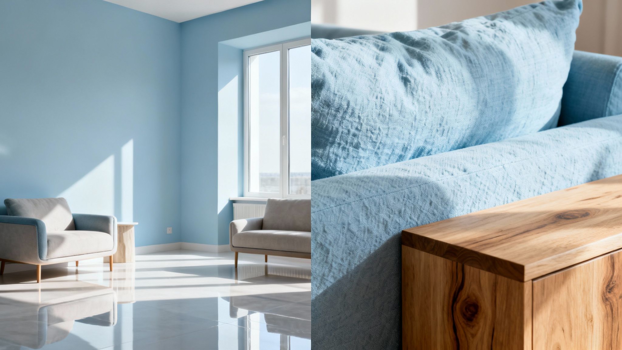
Texture is the second piece of the puzzle, and it’s just as crucial. The exact same shade will look completely different depending on the surface it's on. A single shade of deep blue can feel rich and velvety on a plush sofa cover but look much flatter and more subdued on a matte feature wall.
This all comes down to how different surfaces play with light.
- Smooth, glossy surfaces like silk or polished metal bounce a lot of light around, making colours look brighter and more intense.
- Rough, matte surfaces like linen, wool, or unfinished timber tend to absorb light, giving colours a softer, deeper, and more muted feel.
Layering these different textures is how you add visual weight and stop a colour scheme from feeling one-dimensional. To really get a sense of how light and texture will interact with your chosen colours, tools like 3D rendering for interior design can be invaluable for seeing it all come to life before you commit.
Bringing Your Palette to Life
To truly master this interplay, think in layers. Start with your biggest surfaces—walls and floors—and then start adding variety through your furniture and accessories.
A smooth leather armchair, a chunky knit throw, and a sleek metal lamp all bring different textural notes to the party, enriching your overall palette. For some great ideas on layering soft furnishings, our guide explains how to choose the perfect throw blanket for you.
By combining different textures—wood, linen, metal, and velvet—you create a rich, tactile experience that invites people in. This depth is what elevates a good colour scheme into a truly great one.
Embracing Australian Design Trends and Seasonal Palettes
Tuning your colour choices into current design trends is the secret to creating a home that feels both modern and completely timeless. Here in Australia, colour schemes interior design is really starting to reflect our unique landscape and lifestyle. We're moving towards palettes that feel authentic, grounded, and deeply connected to nature. It's all about turning our homes into genuine sanctuaries.
Local designers are drawing inspiration straight from the bush, championing earthy terracottas, deep eucalyptus greens, and sun-bleached neutrals. These colours create a calming, organic backdrop that feels sophisticated but also effortlessly liveable. This isn’t about fleeting fashions; it’s about forging a lasting connection with our surroundings.
Palettes for the Seasons
Just as the world outside our window changes, so can our homes. Adapting your colour scheme with the seasons is a brilliant way to keep your space feeling fresh and responsive, shifting the mood from bright and airy to warm and intimate.
-
Spring and Summer: Embrace the light with palettes inspired by our stunning coastline. Think sandy whites, soft ocean blues, and gentle greens, with a few pops of coral or sunny yellow. These colours create an open, breezy atmosphere that’s perfect for the warmer months.
-
Autumn and Winter: As the days get shorter, it’s only natural to crave a cosier retreat. This is where richer, warmer tones come into play. They create an inviting, cocooning effect that just makes you want to settle in and get comfortable.
Recent trend analysis shows that deep reds and burgundies are making a luxurious comeback for the cooler seasons, turning living spaces into cosy havens. Shades like Plum Sauce and Ripe Rhubarb add a touch of drama and elegance, tapping into our desire to blend a bit of nostalgia with modern comfort.
This seasonal shift doesn’t require a complete overhaul. The secret is to introduce these deeper colours through adaptable elements like cushions, art, or a new throw blanket.
A simple change can completely alter a room’s atmosphere. Swapping out a light linen throw for a rich, burgundy one, for instance, instantly makes a space feel warmer and more inviting.
Updating your soft furnishings is one of the most effective and affordable ways to align your home with the season. For more inspiration, explore our guide to the best sofa covers Australia has to offer, which makes seasonal updates both stylish and incredibly practical.
Got Questions About Your Colour Scheme? Let's Get Them Answered
Even with a solid plan, that final moment of choosing colours can feel a bit nerve-wracking. It’s completely normal. Let's tackle some of the most common questions that pop up, giving you the clarity you need to move forward with confidence.
So many people get stuck right at the beginning. If you’re feeling overwhelmed, the easiest way to start is to find one colour you absolutely love. Seriously, that's it. Look in your wardrobe or scroll through your Pinterest boards—what's the one colour you're always drawn to? This will be your anchor, the foundation for everything else you choose.
How Many Colours Is Too Many?
This is a big one. Everyone’s afraid of creating a space that just looks chaotic and messy. A brilliant rule of thumb that designers use all the time is the 60-30-10 rule. It’s a simple trick for creating balance.
Here’s how it works:
- 60% of your room should be your dominant, primary colour. This is usually your walls.
- 30% should be your secondary colour, which you’ll see in bigger pieces like furniture, curtains, or maybe an accent wall.
- 10% is your fun accent colour. This is for the little pops of interest you bring in with cushions, art, and decor.
This simple formula is a game-changer. It ensures your colour schemes interior feel cohesive and thoughtfully put together, rather than cluttered.
Can I Mix Warm and Cool Colours?
Not only can you, but you absolutely should! A room filled with only cool tones (like blues and greys) can feel a bit chilly and impersonal. On the other hand, a space packed with only warm tones (like reds, oranges, and yellows) can feel a little intense or overwhelming.
The most inviting, balanced, and liveable rooms always combine both. Picture a calming blue living room that’s warmed up with a tan leather sofa, some timber furniture, and a few brass accents. That beautiful mix is what creates real depth and a natural, comfortable atmosphere.
Finalising a colour scheme is all about trusting your gut while using these guidelines to steer you in the right direction. Don't ever be afraid to grab some sample pots and see how different colours actually feel in your space before you commit.
Ready to bring your new colour scheme to life? The Sofa Cover Crafter offers a stunning range of stylish, washable sofa covers and throws to instantly refresh your living room. Explore our collection and find the perfect pieces to complete your look.